

In his lifetime, M.C. Escher produced more than 400 prints. In a number of these works, the reptile - alongside the bird and the fish - features prominently. After incorporating his first tessellation in the woodcut Metamorphosis I in May 1937, Escher created Development I. It is an intriguing print in which a number of things happen.
Anyone looking at the print for the first time will focus on the centre first and then divert his or her gaze to the edges. In the centre is a pattern that Escher also explored in November 1937 in two drawings that he coloured in watercolour.
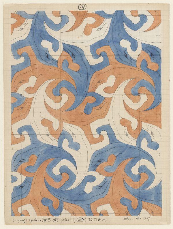
The two drawings differ from each other in a number of ways. Not only is the first drawing softer in colour compared with the second, it also differs in terms of the shape of the salamanders. In the first drawing, Escher is still looking for a way to depict the beaks of the reptiles. In the second drawing, he has found the solution: the beak is opened. This lends a dynamic feel to the little creatures, which seemingly twist and turn into each other. For the print Development I Escher used the biting reptiles of the second drawing.
From the notes he penciled under the drawings, it appears that he used one of the 17 different geometric systems of the Hungarian mathematician George Pólya* for both works. Whereas Pólya worked with abstract shapes, Escher changed their basic structure to produce simplified yet highly realistic reptiles.
Escher had not only Pólya to thank for this transition to movement. Among the articles donated to him in November 1937 by his older half-brother Berend (Beer), were articles penned by the German scientist F. Haag**. In this article, Escher found far more complex forms and shapes than the systems devised and described by Pólya. Thanks to this new insight, Escher was able to bring his (realistic) figures to life: to make them twist and turn. He placed the centre of rotation in the middle of the print, right between the four legs of a white and a black reptile.
Anyone looking at Development I for the first time will automatically focus first on the four black and white salamanders in the middle of the print. Next, they will notice the entire plane and notice that the shapes become increasingly blurry towards the edges.
The title, Development I, raises questions. In our culture, we have a tendency to associate the term "development" with detail and expansion. However, if you direct your gaze from the central pattern towards the edges, you will increasingly see less detail and increasingly more abstraction.
The recognizable black and white salamanders with their bony spines morph into more simplified furiously critters and eventually ‘dissolve’ into an indistinct blurry plane. Finally, all we see along the edges of the print is a suggestion of black and white squares. Only then does it dawns on us that the "development" happens not from the centre to the edges, but the other way round. Working his way from the diffuse black-white shapes on the outside to the centre, Escher gradually added more detail. Slowly but surely, the little squares along the edges mutate into salamanders!
From a formal and technical point of view, this is a stunning work of art in which Escher cunningly plays tricks with our eyes. If you look carefully at the print, you will see just how technically gifted Escher was in creating the illusion of grey in the outer planes. In this near-square print measuring 43.7cm by 44.6 cm, a gradual transition takes place - from vague grey shapes along the edges to clear black and white shapes in the middle - that looks and feels natural.
This effect is easy to achieve in a drawing or lithograph, but this print is a woodcut! A woodcut is a form of relief printing, that is to say that everything that remains takes on the colour of the ink and everything that is cut or gouged out of the wood does not come into contact with the ink. To create grey, he needed to incorporate a lot of white in the black squares, and vice versa. How did Escher achieve this grey effect?
Along the edges, so it seems, he ‘superimposed’ a net of white chequered lines over the squares. In the drawing that he made on the woodblock, he decided which squares should become black and which squares should become white. For the black square, he created thin chequered patterns; for the white square, he created thick chequered patterns. For the thick lines, he gouged away the wood, leaving only white. He cut out thin lines to leave more black; these squares therefore appear to be blacker. Our eyes perceive this combination as grey. The squares are arranged in two rows like a chess board. This pattern enhances the illusion of grey.
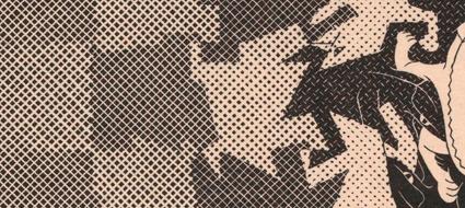

In the next row, where the square morphs into the beginnings of the reptile, Escher added black dots to the white shapes and repeated the chequered patterns in the black squares. In the penultimate row before the centre, where a rudimentary salamander emerges from the previous square, the details appear: an eye, a beak and here and there a line to depict the spine. The white squares have even smaller black dots, while the black squares have the last remaining lines of the chequered pattern. In the centre are the fully formed reptiles.
Eighteen months later, in February 1939, Escher created the tri-colour woodcut Development II. The two "Developments" differ markedly in terms of mood and shape. In Development II, Escher used grey-green and brown as well as black.
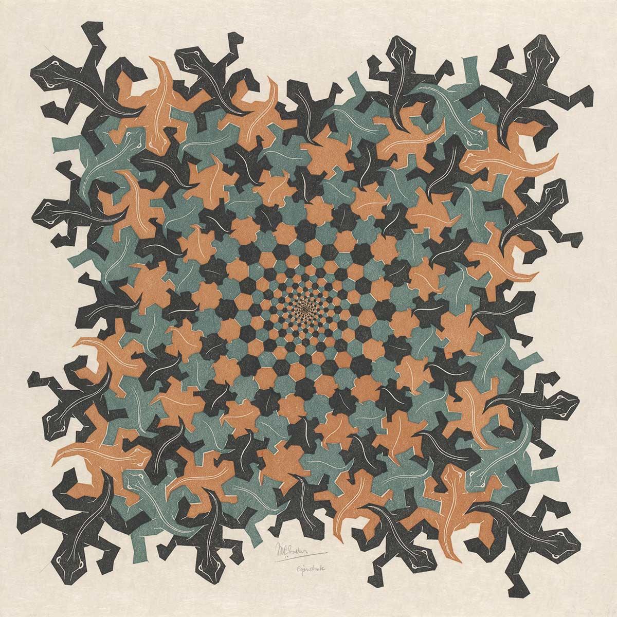
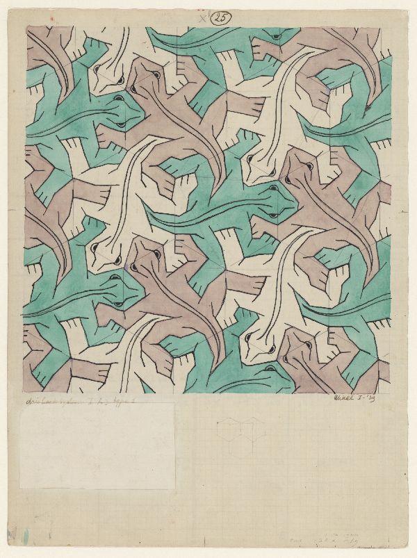
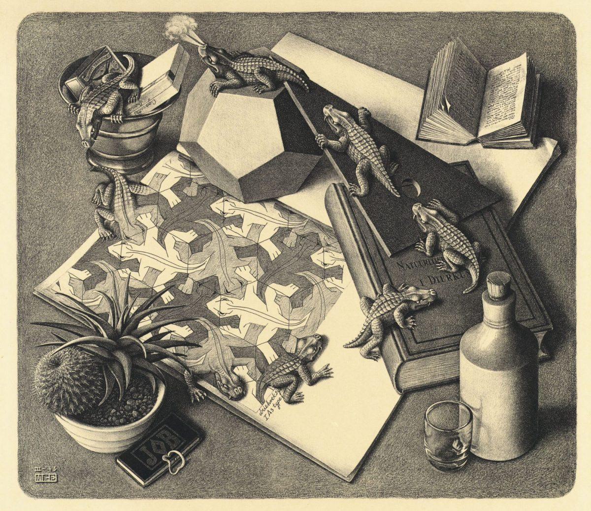
In this new version, the salamander is a friendly crawling creature with a closed beak. This woodcut is based on a different drawing, made in 1939. This drawing is world famous, because Escher used it in 1943 for his lithograph Reptiles.
In Development II, he revisited the idea of visual evolution. Unlike in Development I, however, the change actually does take place from the centre to the edges. The two detail photos below and the print as a whole are self-explanatory.
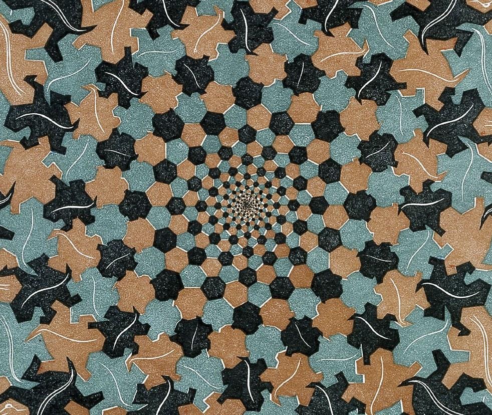
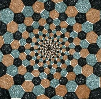
The biggest and most detailed black reptiles have been positioned in the corners. As a result, a circle of light appears to radiate from the centre of the print. This is how Escher evoked a sense of movement, progress. The title Development II makes perfect sense in this context: the small geometric shape in the centre develops into a large, recognizable creature.
Appreciating the intricacies of this work requires time and attention. The more you look at the work of Maurits Cornelis Escher, the more you see. Escher took great delight in hearing about people's interpretations. He was often amazed by what people ‘saw’ in his prints. His work however had no philosophical or religious meaning. But if others believed that they could see hidden messages, it didn't bother him in the least.
Notes:
* G. Pólya: Über die Analogie der Kristallsymmetrie in der Ebene; Zeitschrift für Kristallographie, 1924
** F. Haag: "Die regelmässigen Planteilungen." Zeitschrift für Kristallographie 49 (1911) p360-369 and F. Haag "Die regelmässigen Planteilungen und Punktsysteme." Zeitschrift für Kristallographie 58 (1923) p 478-488
More stories about Escher


Movement in Other world

